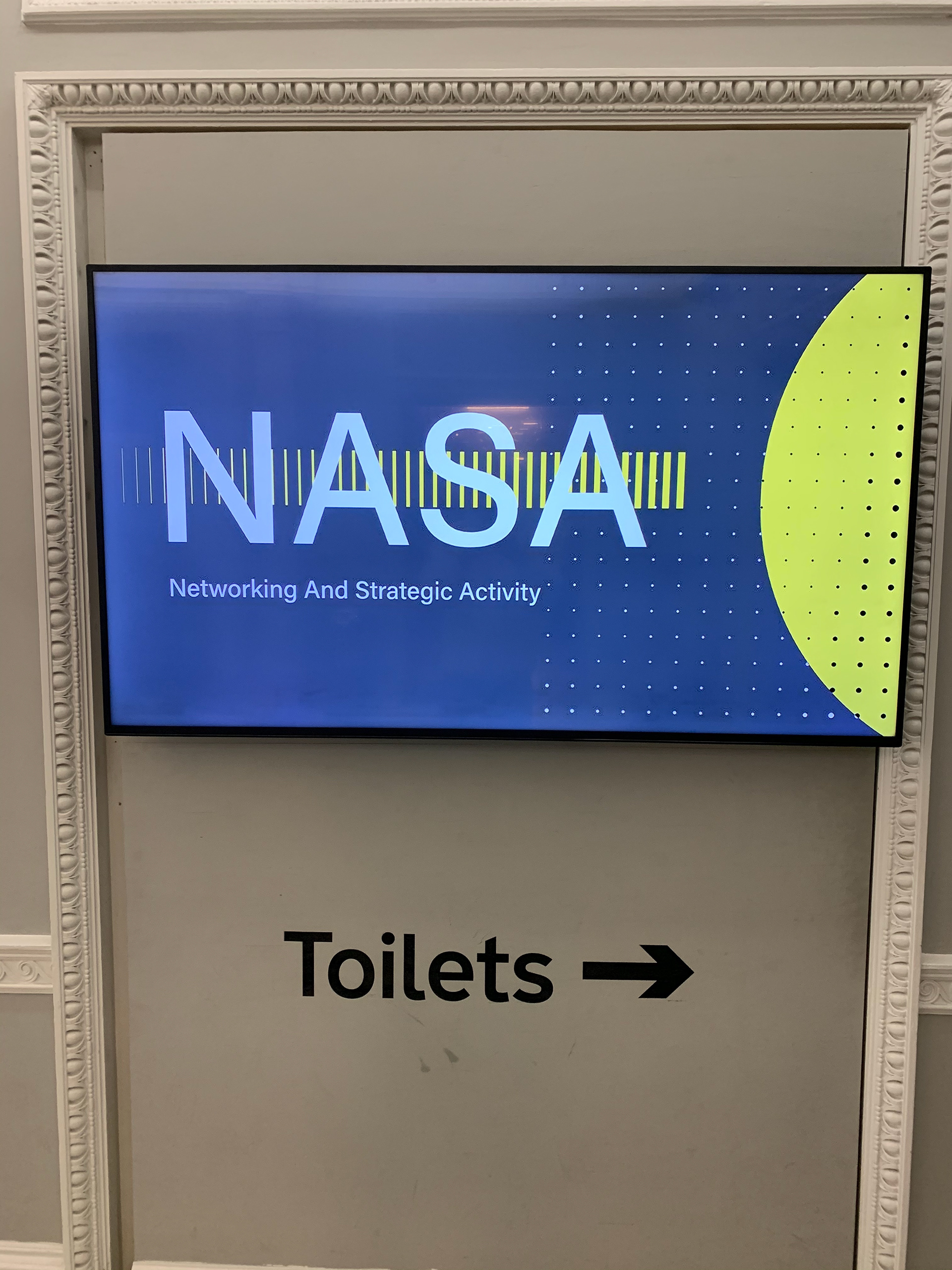
For ComplyAdvantage's NASA event, a gathering that convened the global team for several days of workshops and pivotal updates, I was entrusted with the esteemed role of sculpting the branding narrative. Crafting a logo that seamlessly merged the Networking event, with vibrant digital posters, bespoke lanyards and hoodies bearing the emblem of our collaboration. Each branding element was meticulously designed to celebrate our collective stride towards a future of boundless possibilities.
Inspiration
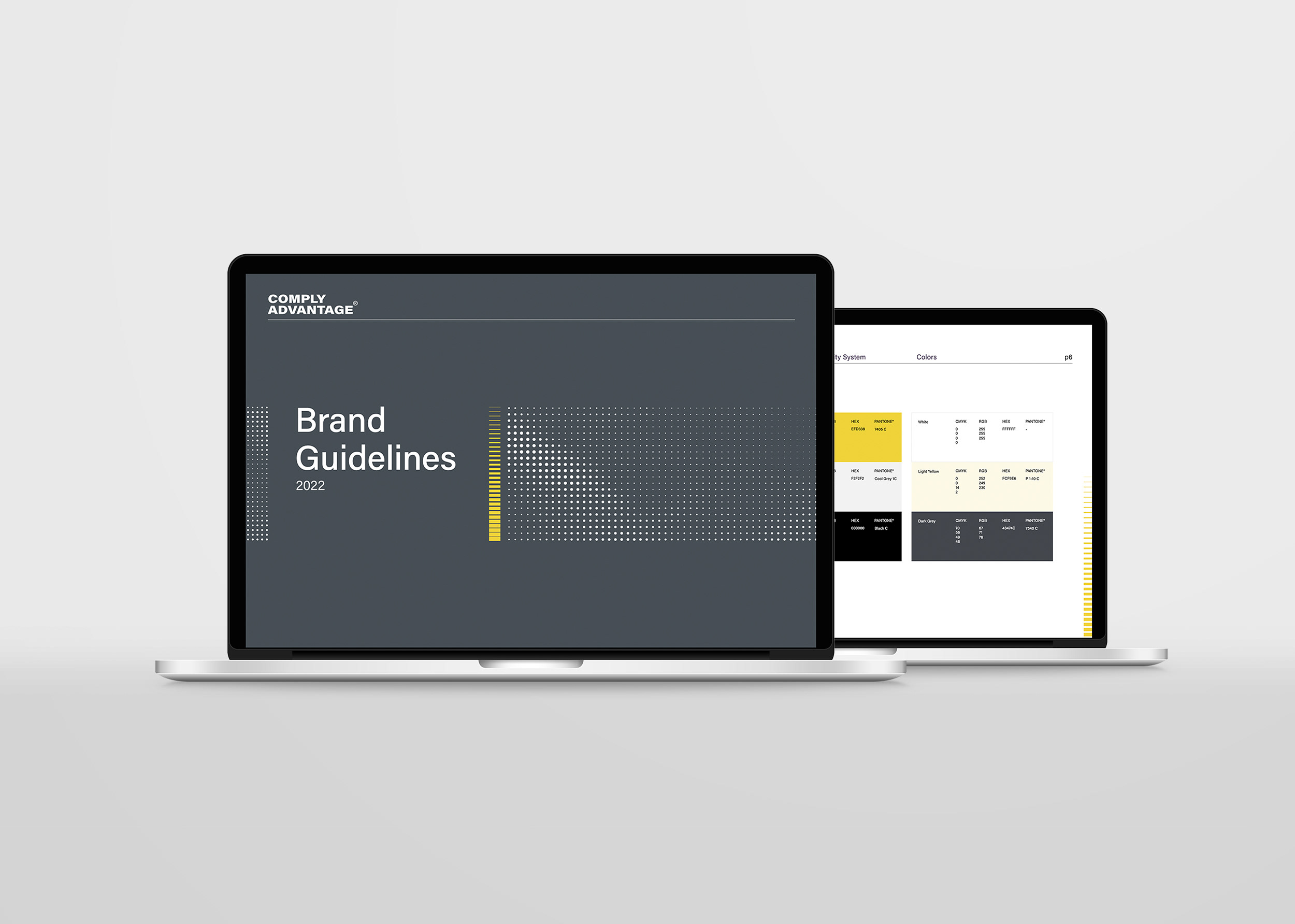
In crafting our event's aesthetic, I drew inspiration by the use of depth and dots, crafting an engaging perspective that mirrored the vast expanse of space. This aesthetic, tied in seamlessly with the branded halftone style of ComplyAdvantage, and echoed the acronym NASA. The signature yellow also provided an allure of a distant planet, representing the enduring quest for understanding and exploration.
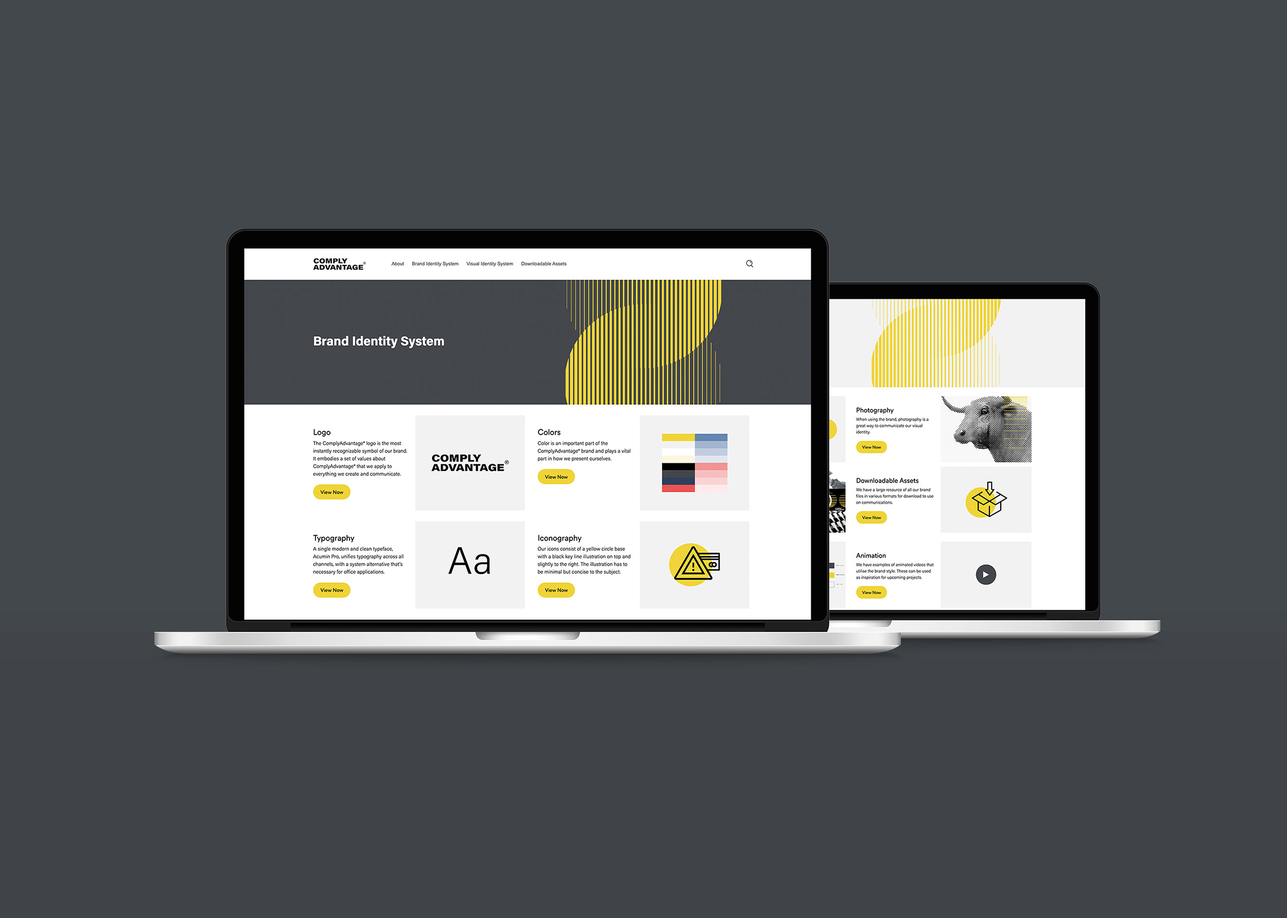
For more information, you can find the halftone visual identity here

Logo Variations / Final
For the NASA logo design, I aimed to channel the grandeur of space while maintaining simplicity. The subtle addition of the yellow gradience offers depth and a narrative capturing the essence of moving forward.
